SupremePunk #070
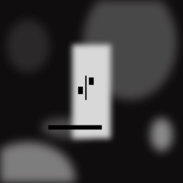
Can't see
This Punk is inspired by CryptoPunk #7241 and the work of Paul Klee. Look closely and you won't be able to see this Punk clearly - it is blurred on purpose, as if an unbreakable and intangible wall has been erected between him and the audience. This wall is the limitations of the human eye that prevent it from seeing things in the colors that they really are. We have held to the idea here that the author's words, because of these limitations, will never be interpreted correctly, so let them be initially veiled so that no one will try to know their original content. And so this Punk will not present a parsing and explanation of ideas, but will describe only the technical part of it.
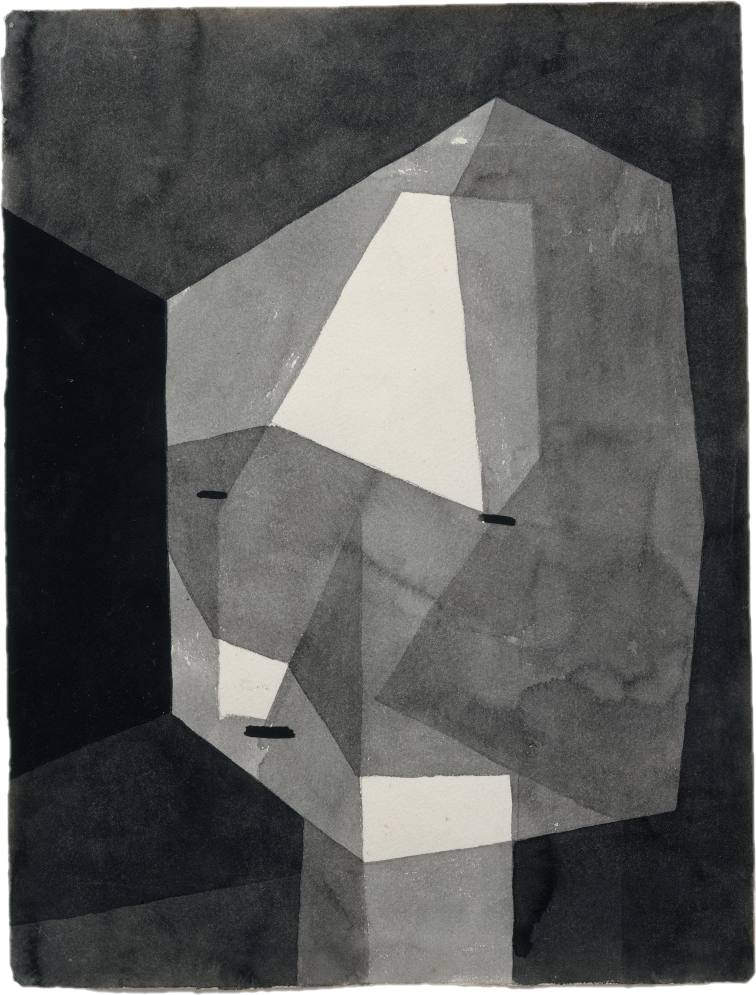
Paul Klee — Portrait of a rough head, 1935
This painting was inspired by a series of portraits created by Paul Klee. In this series, Paul used means of abstraction, and ultimately color, to convey facial features and emotions. In addition to this, he also experimented with ways of applying paint and different working techniques. This prompted us to resort to a very unusual blurring effect that strains both the eye and the mind. We wanted to take our viewer out of their comfort zone and make them think. However, the colors were deliberately chosen so that the eyes were in a physically relaxed state at all times.
The fact is that man faced a big problem when it came to the transfer of color from the artist to the viewer. In our visual perception we almost never see color as it is in reality, as it is physically. This fact makes color the most relative visual medium in art. The first thing to grasp is that color can be read in a countless number of ways. Our endeavor will be to develop--by experience, by trial and error--a sense of color. That is, to learn to see the effects that color produces, and to feel how colors are interrelated. This Punk foreshadows a series of the next 10 Punk (71-80), each of which and altogether will employ color illusions and effects that deceive the eye.
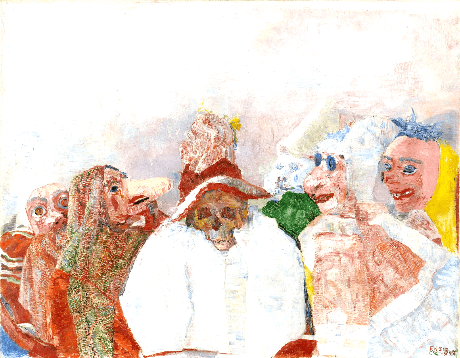
Cheaper and better in a sense of color reproduction of Masks Opposing Death, 1888
There is a well-known case where the differences became very apparent: in the early 20th century, different reproductions of James Ensor's painting "Masks Opposing Death," 1888, were produced. The first was a large and official reproduction, printed with a frequent raster grid on very high quality paper, which it would seem should be much more representative than the second reproduction, smaller in size, printed on ordinary equipment and the cheapest paper. But the second one is not just the most correct in terms of tonality, it also clearly shows another mask (or maybe it's a face or head), whereas the more expensive photo doesn't show it. This small mask-like face is lighter in tone than the others and is shown away from the rest of the figures, on the left, near the border of the picture. This shows how a color characterized by greater lightness can get lost in a photograph. Here's an example of how different reproductions could look like.
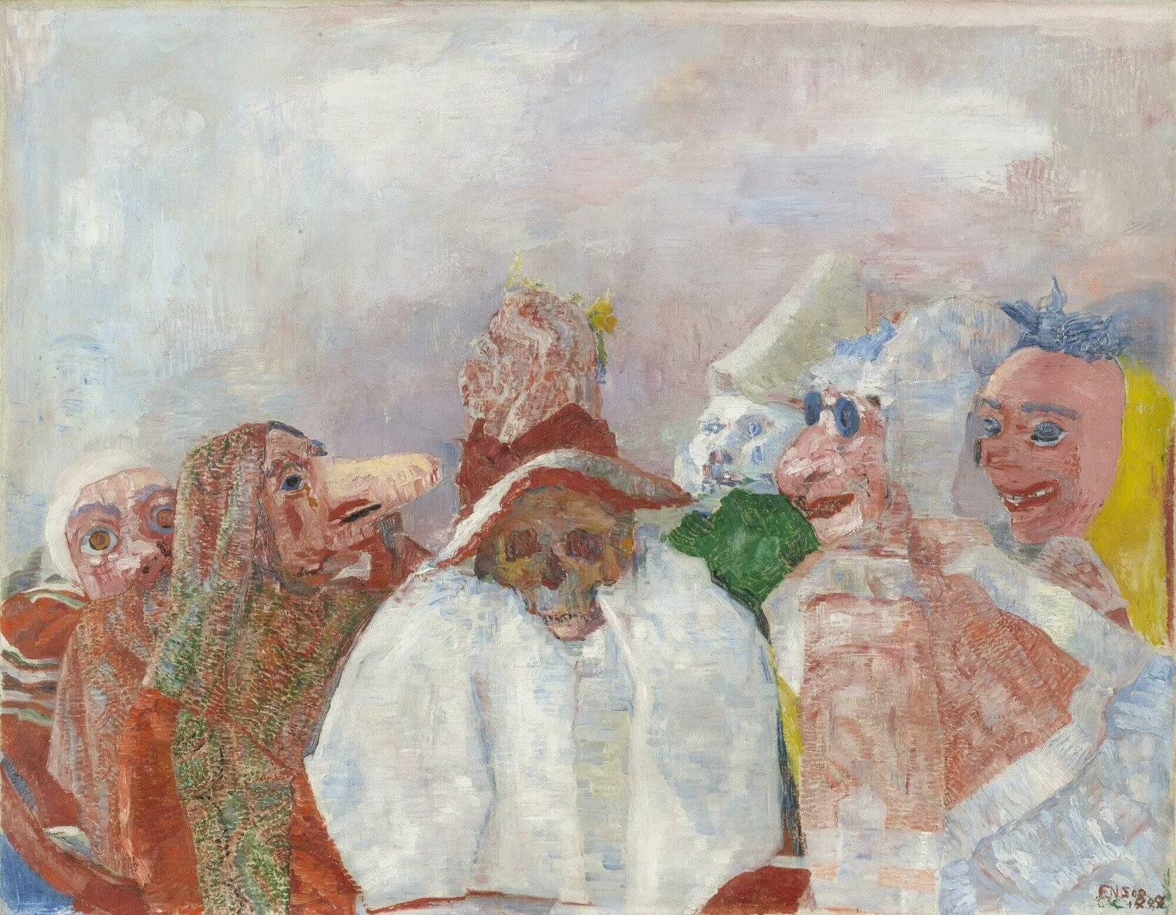
Official and wrong in a sense of color reproduction of Masks Opposing Death, 1888
The main advantage of the eye over photography is that it uses scotopic, that is, twilight, vision in addition to photopic - daytime vision. The presence of the former means that the retina is able to adjust to different light conditions. Color photography departs even further from vision than black and white. Reds and blues are over-emphasized, so much so that their brightness is exaggerated. The public seems to like this, but the result is disappointing: subtle nuances and delicate transitions are lost. White rarely comes out white and instead appears greenish. Because of this, color reproductions of Mondrian's paintings are sometimes simply unbearable to look at. A similar thing can be said in the era of web art. Here it would seem that the situation should have improved due to the fixed color within a single file (it is coded in a single way and the color code always remains the same), but just like the human eye, each monitor displays color in its own way. Moreover, the perception of an individual work is also affected by the user's own brightness and color settings, which can lead, in the extreme, to a complete distortion of hues. thus, to sum up, it is never possible to answer with complete certainty the question: do we see the picture as the artist saw it?

Buy

Gallery:

CryptoPunk #7241 that has been taken as a base
Your transaction is in progress

You have connected to the wrong network
Transaction is successful!